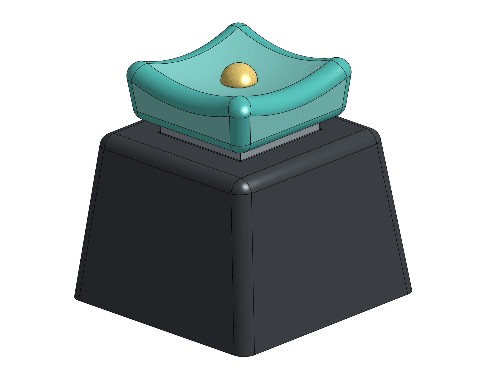
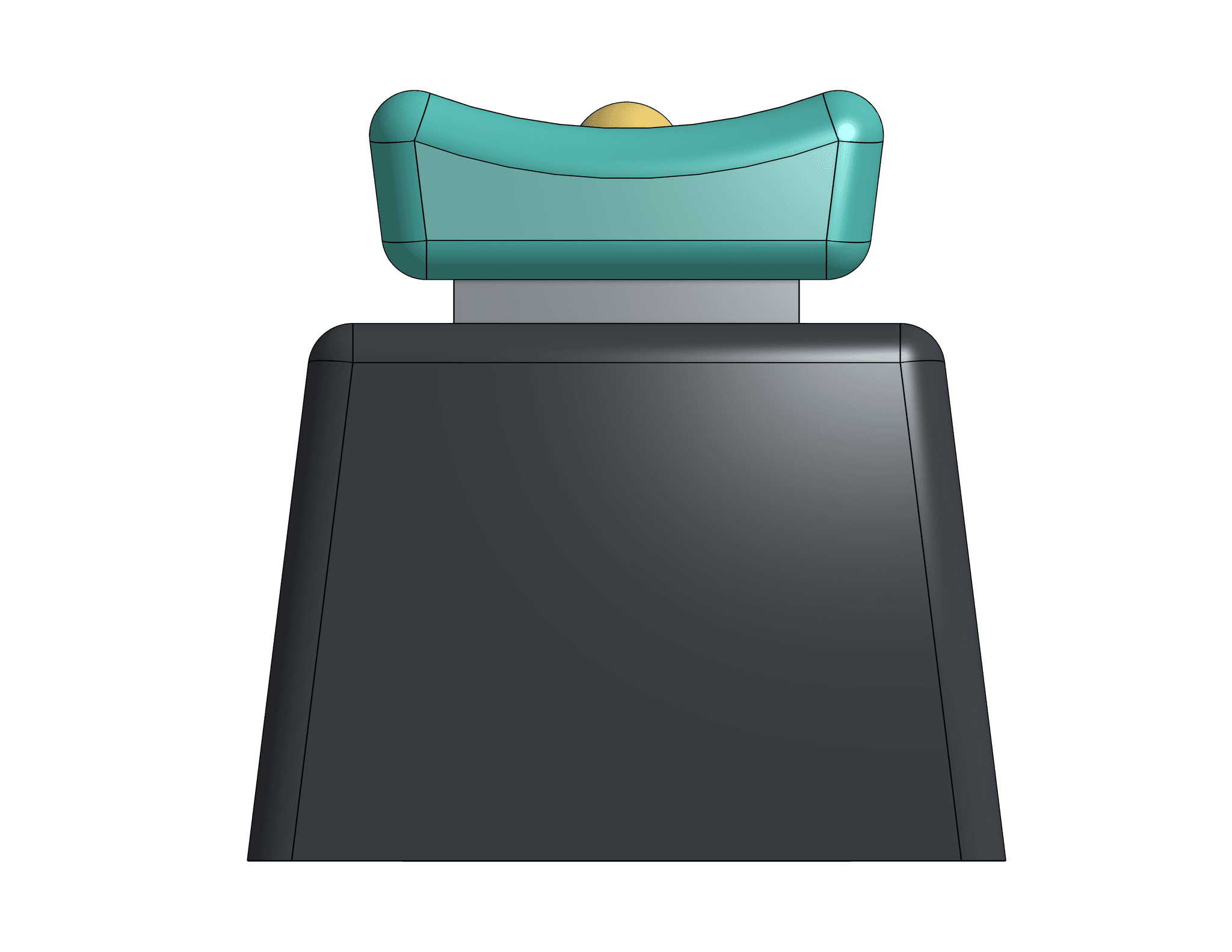
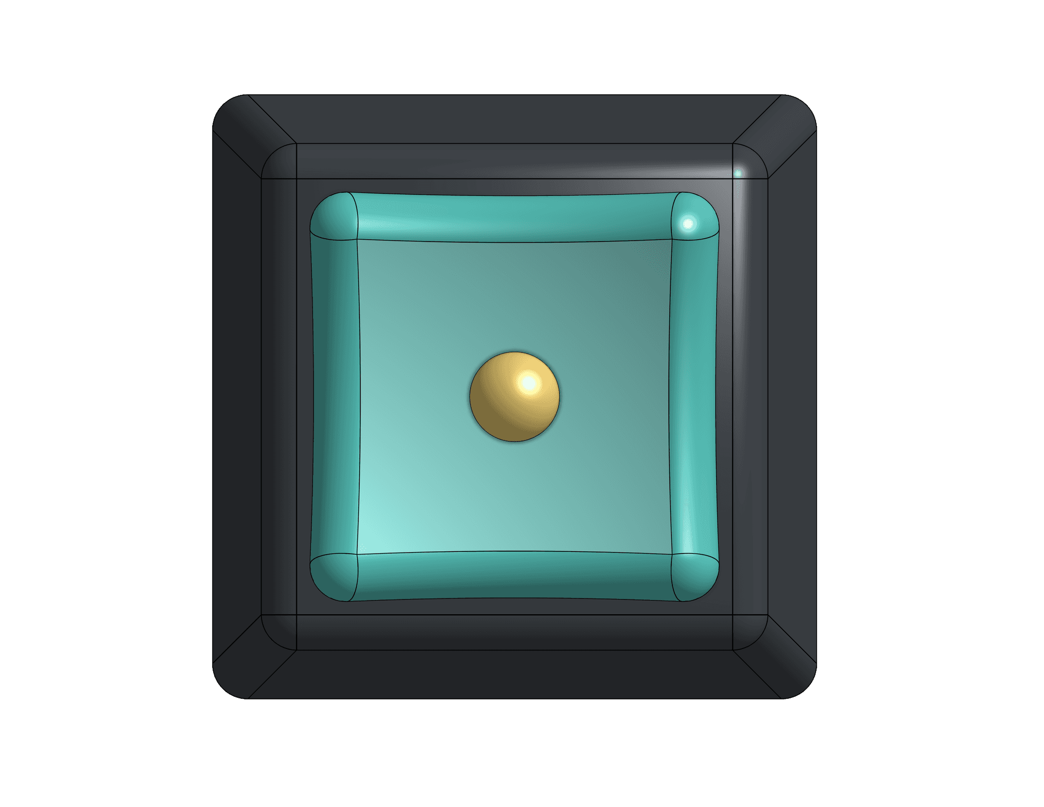
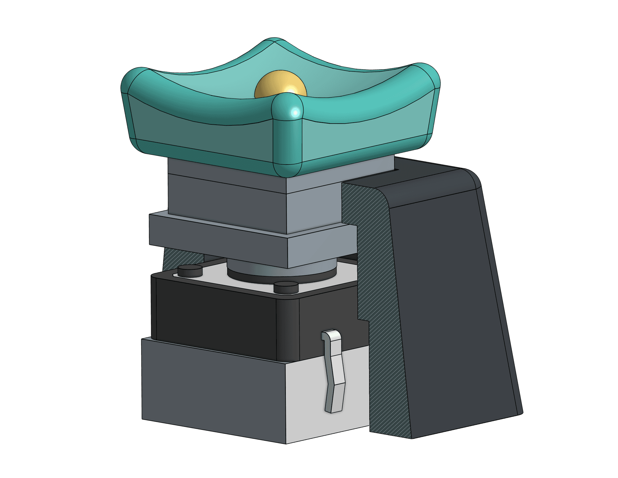
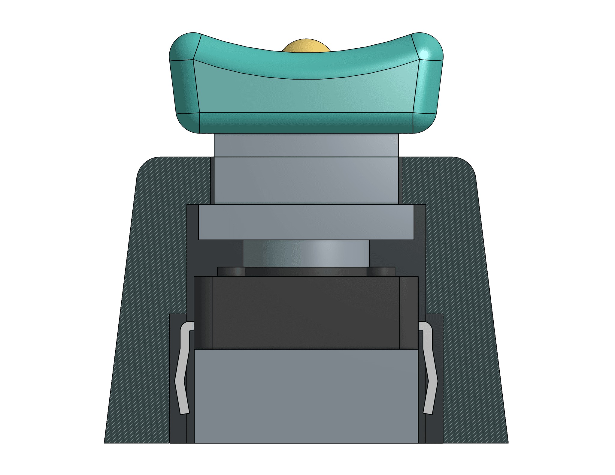
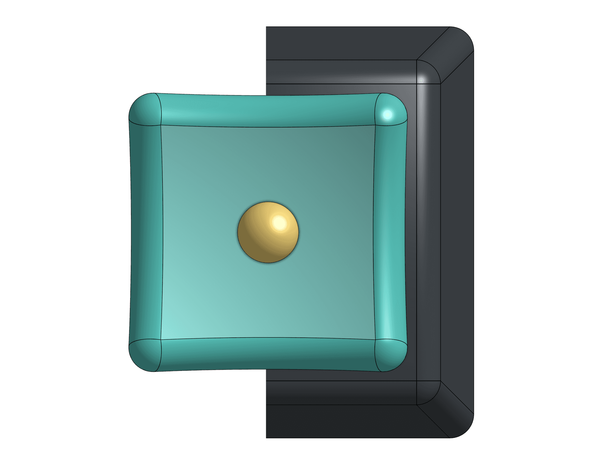
After reading the "Differently Abled People" and "Manual Controls" chapters of The Measure of Man and Woman by Alvin R. Tilley, I utilized my newfound knowledge to create a more accessible-friendly housing for a push button. First, I followed the basic guidelines of concaving the button cap so people who need it, can have a more firm grip while pushing down. Furthermore, I enlarged the button cap by about 25%. Individuals who may have a tremor in their hands or fingers may find a larger button cap to be easier to access. In the center of my button cap, I added a semi-sphere for people who might be low vision. The semi-sphere itself provides reassurance that they are pushing the top of the button while allowing extra tactility and grasp. To further support individuals who have visual disabilities, I used contrasting colors on the button cap (turquoise) and semi-sphere (yellow). My intent, with these colors that stand out in their own way, is to draw one’s attention to the yellow semi-sphere, permitting them to intuitively and confidently know where the button cap is.

